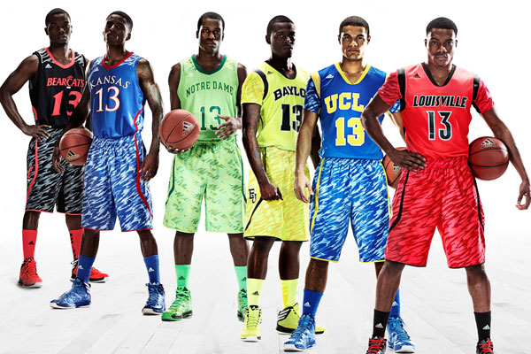
New uniforms next year

Iowa has had a number of minor changes that basically amounted to polishing a turd, it is well beyond the time to go away from the ugly font. Too clunky and NASCAR looking.

Iowa should have great looking uniforms, they already have a great color scheme and logo.
 
If any of the few previous links are an indication of what Iowa will be wearing, expect some tinkering with the color schemes, and alot of gray in the jerseys.. Correct?

If so, can't say I'm crazy about it. Stick to black and gold!

Not sure what's up with MSU going to the gold and green.. Makes them look like S. Florida.
I guarantee that they won't be gray. It was something Nike did for big time programs to give them alternate uniform for one game. I hope they have the jerseys that have a pattern on the back of the unis that have a special significance to the university, like put the old capital building with a tiger hawk over lapping it.
 
BB uniforms can get ugly in a hurry if they try to be too trendy or innovative. Stay classic, Iowa.
 
BB uniforms can get ugly in a hurry if they try to be too trendy or innovative. Stay classic, Iowa.

What do you mean???

ncb_e_uniforms11_600.jpg
 
Because a better program can't do that? This is nothing more than a cash grab.

I agree.

signed, Indiana U.

(This doesn't mean I am against the change. I honestly have trouble even picturing the current uniforms. I figure that is not a good sign re: the design.)
 
I agree.

signed, Indiana U.

(This doesn't mean I am against the change. I honestly have trouble even picturing the current uniforms. I figure that is not a good sign re: the design.)

Iowa has changed uniforms frequently for decades. I honestly can't keep track of all the uniforms the Hawks have worn over the years. I'm ready to get rid of our current duds, not to wash the bad taste out, but to just get rid of some awful uniforms.

Indiana, on the other hand, has made very few changes. The colors shifted more to scarlet and white for awhile, rather than crimson and cream, but other than that, the uniforms have stayed the same for decades.
 
I agree.

signed, Indiana U.

(This doesn't mean I am against the change. I honestly have trouble even picturing the current uniforms. I figure that is not a good sign re: the design.)

I'm not opposed to minor changes or tweaks in the design - the football program makes small, almost unnoticeable changes every year. But scrapping it in favor of a new system less than 5 years after it's debut is stupid. There's nothing wrong with the current uniforms that a better program can't cure.
 
The previous links were, like already posted, alternate uniforms on a one game basis. The jerseys will look more like:

images


53-10697-J.jpg


52-90198-F.jpg
 
Iowa has changed uniforms frequently for decades. I honestly can't keep track of all the uniforms the Hawks have worn over the years. I'm ready to get rid of our current duds, not to wash the bad taste out, but to just get rid of some awful uniforms.

Indiana, on the other hand, has made very few changes. The colors shifted more to scarlet and white for awhile, rather than crimson and cream, but other than that, the uniforms have stayed the same for decades.


Like I said, I am not even sure what the current uniforms look like. I can conjure them up if I try really hard but I have no problem with a change. I do have some concern that they will pick one of the (what I consider) god-awful designs out there.
 
How would you be able tell if Penn State was wearing throwbacks?

Pretty sure he's referring to the Hawkeye jerseys with the cursive "Iowa" that they wore against Penn State last year.

Anyway, I can handle some change and tweaks in the design.. It seemed like under Mr. Davis, it was never really the same jersey twice. Most of them looked pretty good IMO, with a couple of exceptions.
 

Latest posts

Top