NattyBumppo
Well-Known Member

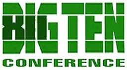
My humble attempt to hide a 12 in a Big Ten logo. Feedback? Other ideas?


In case anybody reads this thread after bar close tonight


I like it. Kind of reminds me of the hidden arrow in the FedEx logo. Do you have mock-ups ready for 14 and 16 yet?

I like the lines all the way across. Makes it look like a football field. I tinted it green... I like it this way:
