You are using an out of date browser. It may not display this or other websites correctly.
You should upgrade or use an alternative browser.
You should upgrade or use an alternative browser.
Time for a new uniform?
- Thread starter homes
- Start date
MelroseHawkins
Well-Known Member
On the current uni's I don't like how high the number looks on the back. In addition, there's a poofy part right in the middle of the back of the neck area that sticks out which drives my wife nuts.
How about these with the "I" on the shorts. Ugh.

How about these with the "I" on the shorts. Ugh.

D
DDThompson
Guest
Nice.Not a huge fan of the existing uniforms, but better than the prior one. A new style I'd like to see, with an homage to the past:
(couldn't edit out the pink square, so keep it if such stuff appeals to your finer sensibilities)
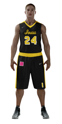
Tigerhawk where pink is
The bulge thing on the back under the name is a tracking device of some sort. I have always thought the same thing that it looks dumb tho. Then I heard on a podcast that it tracks the health status of the player in real time. I haven't seen any other teams use them though so I can't imagine the data is very useful.
On the current uni's I don't like how high the number looks on the back. In addition, there's a poofy part right in the middle of the back of the neck area that sticks out which drives my wife nuts.
How about these with the "I" on the shorts. Ugh.

1977Hawkeye
Well-Known Member
I liked most of the Iowa jerseys back in the 80's and 90's.. Thought they kinda went to garbage when Alford was coach, using the slanted "impact" font for everything or whatever you call it. Meh.
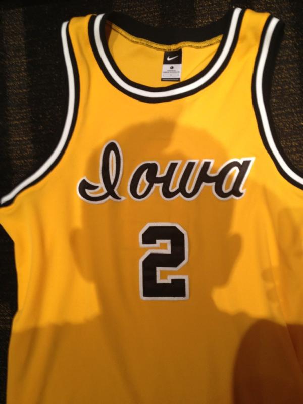
Although I really don't mind the current jerseys all that much but with Nike doing everything, I don't know what it is, they all kinda seem the same somehow, from team to team. I like a more unique look. The cursive "Iowa" would do it, as well as being a throwback to the past.
A couple other looks from the past that I don't mind. I especially like the one Street is wearing.


1977Hawkeye
Well-Known Member
I remember it may have been Fran's second year? The Hawks wore the throwback jerseys in a home game against PSU IIRC:


MelroseHawkins
Well-Known Member
The bulge thing on the back under the name is a tracking device of some sort. I have always thought the same thing that it looks dumb tho. Then I heard on a podcast that it tracks the health status of the player in real time. I haven't seen any other teams use them though so I can't imagine the data is very useful.
You being serious!??
D
DDThompson
Guest
Good point. I liked the look of that uniform but something seemed off and I couldn't put my finger on it.I hate uniforms with a contrasting belt of color at the waste. They look like 19th century bathing suits to me.
You did.
Maybe a thin contrasting color for the belt line would look better. But you're right.
homes
Well-Known Member
MiniMoeHawk
Well-Known Member
Throw on the ANF while you're at it
homes
Well-Known Member
The "MAC" on State's jersey stands for Michigan Agricultural College, its original name. I'm starting to sound like a uniform nerd.I like what we have but maybe if you throw a MAC logo on the front of your design like Michigan State had on the other jersey the night when we played them it would look better.
taffaej
Well-Known Member
Interesting. I was waiting for the announcers to say something, but either they didn't or I was running to the fridge and missed it.The "MAC" on State's jersey stands for Michigan Agricultural College, its original name.
vork22
Well-Known Member
This should be the jersey for eternity!I remember it may have been Fran's second year? The Hawks wore the throwback jerseys in a home game against PSU IIRC:
