NightmanCometh
Well-Known Member
NO changes.......except I'd LOVE to see them wear black socks/shoes.
+1, black socks and shoes always look good.
NO changes.......except I'd LOVE to see them wear black socks/shoes.
I don't think we should change anything. Our uniforms are almost identical to the Steelers. Iowa resembles the Steelers of college football. I think they're a pretty good franchise to resemble. Tough, hardnose, run right at you until you stop us sort of football. Not to mention a winning franchise. The Nike swoosh is already on the jersey, I believe it's on the pants as well. Also the players are wearing all kind of Nike apperal from gloves to armbans. Nike, imo, is branded quite well on the Iowa's uniforms.
I'm not against minor incrimental adjustments, but I don't want to see a complete redesign. The Tiger Hawk has become classic iowa.
What if we give Herky a more of a Rambo motif. Get him all ripped on steroids, shirtless, a bandana and a long jerry curl mullet and some military boots with a blade that comes out of the toe. But he would need a HUGE knife and an even bigger gun....like "old painless" that Jesse Ventura carries in Predator...and maybe rather than being carried out to the 50 yard line by the cheerleaders before every game, he rides in on a tank with monster truck wheels and there will be pyrotechnics, I'm not talking some whimpy sparklers, I mean some freakin' 20 foot flames, like the ones that barbequed James Hetfield from Metallica. And speaking of Metallica, we should replace the Enter Sandman before the game with some Slayer, or Cannibal Corpse...or play them both at the same time. Oh yeah and blood coming out of Herky's mouth. I like that one Greg. That would be one badass mascot.
I have not read one post in this thread, but i seen the topic and my vote is
F-WORD NO!!!!!
There are small changes made every year, but as long as the logo stays the same, most people don't notice. For example, the word "Iowa" right on the neckline of the jersey in 2008 wasn't there in 2007, and was changed to the tigerhawk last season.

1st uniform rule:
simpler = better
2nd uniform rule:
know your brand
----------------------
Iowa has a very strong brand. Not Penn St or Alabama, but in the next tier below. Nothing should be done to damage that brand.
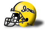
the basic structure of the helmet CANNOT be touched (black base / single gold stripe / gold tigerhawk stencil), with one exception ... retro/throwback:
Jerseys should be free of "IOWA" or "HAWKEYES", but rather contain only numbers, simple sleeve stripes, and begrudgingly the players' names ... a small tiger hawk on the collar point is OK if it is held to the same simple stencil standard as the helmet logo (no white trim or surrounding oval, etc.)
However, the pants/socks/shoes are a little more open to fluctuation, IMO ... I would love to see black shoes/socks on occasion, and perhaps an alternate pant ... perhaps white or black, or at least a variation on the thick black stripe on the gold pant
I like the Steelers-based design. It looks great, and it adds to the hard-nosed blue collar ethic that the Hawkeyes embrace. I don't think it was a "rip-off." Didn't Hayden get an OK from the Steelers? And now it's a three-decade tradition, associated with the best period of sustained success for the program.
I could support some minor, occasional variations, like the following.
a) 50's style throwback, maybe once every 2 or 3 years
b) black-on-black home unis in conjunction with a fan "blackout"
c) white-on-white road unis, I just think that'd look pretty slick
What's with the Nike "ProCombat" uniform? Is it supposed to have some game-play advantages, or is it just a new fashion?
And finally, unless Paul McCartney is involved, I don't ever want to see "wings" again!
The Combat material is designed to be WAY lighter. It's said to be lighter when soaked than the current jerseys are when dry. I have a friend who is playing football at New Mexico, and he's come into contact with the stuff, and says it's legit.
The designs used for the Combat uniforms this year were just gimmicks, IMO. The schools can request the regular designs with the Combat material, and I suspect many will go that route.
Thanks for this. We should tell Nike we want the classic unis with the high tech material and don't fudge around with the design. I'm not interested in Phil Knight's vision of what Iowa's uniforms should look like. He gets to stick his dang swoop all over the place anyway, that should be enough.
