You are using an out of date browser. It may not display this or other websites correctly.
You should upgrade or use an alternative browser.
You should upgrade or use an alternative browser.
Ugly or really ugly?
- Thread starter hoffahawk
- Start date

storminspank
Justin VanLaere
Ugly, but could have been uglier...
V
VintageHawkeye
Guest
That's nasty, but boise state's FB field is still uglier.
#uglystrong
#uglystrong
Churlish79
Well-Known Member
If you have to keep saying "Chicago's Big Ten Team".. you probably aren't.. #NotSayingJustSaying
hawkeyescott
Well-Known Member
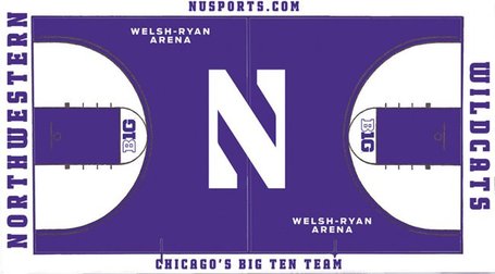
Anyone know why the N at mid court is a different purple (almost blue) as compared to the rest of the court?
aeischeid
Well-Known Member
That's nasty, but boise state's FB field is still uglier.
#uglystrong
See: Eastern Washington.
Yuck.
Churlish79
Well-Known Member
Anyone know why the N at mid court is a different purple (almost blue) as compared to the rest of the court?
The N actually looks like the right color.
The rest of the floor looks like poorly applied water colors.
hawkeyescott
Well-Known Member
The N actually looks like the right color.
The rest of the floor looks like poorly applied water colors.
Well which ever color is the right color it looks really stupid with two different shades of the same color.
aeischeid
Well-Known Member
The N actually looks like the right color.
The rest of the floor looks like poorly applied water colors.
Almost like lavender colored fake granite.
hawkeye12345
Well-Known Member
How in the world are we going to be able to spot the NW players? The entire floor is white.
1977Hawkeye
Well-Known Member
Never was a fan of completely filling in everything with color inside the 3-point arc.. Even though the lane isn't purple.. Just too much color. Less is more..
But I agree with the other poster who said the new purple looks more like water color. Or like someone colored it in with a big purple crayon. It looks odd.
But I agree with the other poster who said the new purple looks more like water color. Or like someone colored it in with a big purple crayon. It looks odd.
V
VintageHawkeye
Guest
Boy, for an "elite private university with really super-smart kids, mostly Asian", they sure don't have much common sense, do they.
#VirginU
#VirginU
storminspank
Justin VanLaere
3 shades, if you count the banners.The N actually looks like the right color.
The rest of the floor looks like poorly applied water colors.
trapperjon
Well-Known Member
The N actually looks like the right color.
The rest of the floor looks like poorly applied water colors.
The N is opaque (meaning it is paint that does not show the wood grain) while inside the 3 pt arc is translucent stain that highlights the wood grain. Think of a curly maple guitar top like a Paul Reed Smith or a Les Paul. I'll bet close up & in person the 3D look of the stain looks better than the opaque N.
They should have stuck to just one though.
Igothawked
Well-Known Member
Really ugly gets my vote. jNW is my most hated basketball team, followed closely by the Bucking Fadgers. I really hope jNW's NCAA tournament streak continues.
Bubbrub
Well-Known Member
Where's the Mediacom logo?
No kidding. As ugly as it may be, at least they haven't sold out.
