You are using an out of date browser. It may not display this or other websites correctly.
You should upgrade or use an alternative browser.
You should upgrade or use an alternative browser.
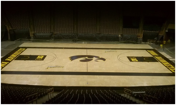
Petition to Return CHA Court to Gold?
- Thread starter wundergrape
- Start date
JonDMiller
Publisher/Founder
I actually like the court how they have it now.
HaydenHawk56
Well-Known Member
I would love for the court to go back to the Tom Davis Days. Bring back the Yellow!
HobbieHawk
Well-Known Member
More importantly, how about getting rid of the $#!+ brown seats
HawkeyeShane
Well-Known Member
I prefer this...

The black stands out more and I love the Tiger Hawk outlined in gold instead of yellow...the old court was yellow.
Edit: I tried to find a pic of the old yellow court for comparison, but holy crap...it's almost as if Google flat out refuses to let me find one...

The black stands out more and I love the Tiger Hawk outlined in gold instead of yellow...the old court was yellow.
Edit: I tried to find a pic of the old yellow court for comparison, but holy crap...it's almost as if Google flat out refuses to let me find one...
HawkeyeShane
Well-Known Member
More importantly, how about getting rid of the $#!+ brown seats
The best way to do that is have them covered with fans dressed in black 'n gold.
I would like to see center court have a large silhouette of the state of Iowa in gold, with a large, black, block-letter I on top of it.
I've thought about this too, it would be awesome. But it wouldn't be original. Indiana has their state silhouette at midcourt and UNC too. So it would be a little copy-cat like, but it would still be sweet.
I am in favor of the yellow paint. The black is okay, but that's because it's black- and anything black always looks pretty good (in moderation). The yellow would be unique and a great throwback.
What really bothers me (albeit nothing) is the decals/logos on the court. The mediacom stickers really annoy me. Yet, the name Mediacom Court could be worse, it has a decent ring. If that is the actual name, why doesn't mediacom create a means to show all of the Iowa games on TV in the DM area? 'We're going to put a huge, ugly sticker on your basketball court, advertising ourselves, and not even show your games?' Mediacom wouldn't even agree to the BTNetwork for the longest time. So all in all, I kind of despise Mediacom, and the floor decals.
Last but not least, the midcourt logo sucks. In my mind, if I were to imagine the one half court logo that I would never want as an Iowa fan... It would be an oversized tigerhawk. It looks terrible. I love the courts with old fashioned half court logos, in other words: a small logo that fits inside the halfcourt circle. Not some stupid KU jayhawk measuring 50 ft wide. I would love to see a smaller logo, maybe the same tigerhawk, or a block I or something.
wundergrape
Well-Known Member
Well, you're all clearly wrong. The yellow floor was much, much better.
At any rate, the masses seem to have spoken in favor of the deplorable black floor. I humbly withdraw my request for a petition. It will always be gold in my heart, though, and none of you bastards can touch what's inside of me. Without a warrant.
At any rate, the masses seem to have spoken in favor of the deplorable black floor. I humbly withdraw my request for a petition. It will always be gold in my heart, though, and none of you bastards can touch what's inside of me. Without a warrant.
I prefer this...

The black stands out more and I love the Tiger Hawk outlined in gold instead of yellow...the old court was yellow.
Edit: I tried to find a pic of the old yellow court for comparison, but holy crap...it's almost as if Google flat out refuses to let me find one...
i vote for this court
HawkeyeShane
Well-Known Member
I've thought about this too, it would be awesome. But it wouldn't be original. Indiana has their state silhouette at midcourt and UNC too. So it would be a little copy-cat like, but it would still be sweet.
I am in favor of the yellow paint. The black is okay, but that's because it's black- and anything black always looks pretty good (in moderation). The yellow would be unique and a great throwback.
What really bothers me (albeit nothing) is the decals/logos on the court. The mediacom stickers really annoy me. Yet, the name Mediacom Court could be worse, it has a decent ring. If that is the actual name, why doesn't mediacom create a means to show all of the Iowa games on TV in the DM area? 'We're going to put a huge, ugly sticker on your basketball court, advertising ourselves, and not even show your games?' Mediacom wouldn't even agree to the BTNetwork for the longest time. So all in all, I kind of despise Mediacom, and the floor decals.
Last but not least, the midcourt logo sucks. In my mind, if I were to imagine the one half court logo that I would never want as an Iowa fan... It would be an oversized tigerhawk. It looks terrible. I love the courts with old fashioned half court logos, in other words: a small logo that fits inside the halfcourt circle. Not some stupid KU jayhawk measuring 50 ft wide. I would love to see a smaller logo, maybe the same tigerhawk, or a block I or something.
They should at least make the mediacom logos black trimmed in gold so they fit in instead of looking like they don't belong on the same floor.
Well, you're all clearly wrong. The yellow floor was much, much better.
At any rate, the masses seem to have spoken in favor of the deplorable black floor. I humbly withdraw my request for a petition. It will always be gold in my heart, though, and none of you bastards can touch what's inside of me. Without a warrant.
Hey man, I'm with you. I don't understand how people like this floor better, or how people think the current jerseys are good looking. But hey, keep fighting the good fight
SwirlinLingerie
Well-Known Member
I'm with you 100%. Love the gold/yellow court. It also matches the field house (what you could see that was left in the North Gym). From Lute to George to Tom was the gold court. The black coincides with the era Iowa lost its identity and about half its fan base.
The black is pretty ugly, in my opinion. Ruins the beauty of the wood around it. It also feels like a slow tempo style.
The black is pretty ugly, in my opinion. Ruins the beauty of the wood around it. It also feels like a slow tempo style.
HawkeyeShane
Well-Known Member
Well, you're all clearly wrong. The yellow floor was much, much better.
At any rate, the masses seem to have spoken in favor of the deplorable black floor. I humbly withdraw my request for a petition. It will always be gold in my heart, though, and none of you bastards can touch what's inside of me. Without a warrant.
Don't worry grape, none of us wanted to touch it anyway...
DwayneTwill
Well-Known Member
The black court sucks. Going back to yellow would be much better.
hawkeyeguy85
Well-Known Member
Like the current court.
Wouldn't mind having "The University of Iowa" nameplate back along the mid-court sideline.
Wouldn't mind having "The University of Iowa" nameplate back along the mid-court sideline.
GhostofBTT
Banned
Well, you're all clearly wrong. The yellow floor was much, much better.
At any rate, the masses seem to have spoken in favor of the deplorable black floor. I humbly withdraw my request for a petition. It will always be gold in my heart, though, and none of you bastards can touch what's inside of me. Without a warrant.
Columbus Crew sucks.
tm3308
Well-Known Member
I like the black, although I do prefer the Flying Hawk logo better than the Tigerhawk for basketball. I really loved the concept someone created with the Oregon-style floor, where we had the Flying Hawk logo as a kind of watermark that took up half the floor. That looked awesome!
