New Uniforms for the New McEra

HuskerlandHawk

Well-Known Member
Even though it's of little importance in the big picture, I think it'd be a great thing for Iowa to change out their jerseys once again. When they came out with the new uniforms about a year and a half ago I was expecting a clean, simple, design. Instead we over-designed uniforms with thick ugly collars (that look dog collars), a logo that's hidden within a diamond (since when did the tigerhawk have to be encapsulated in anything...let it stand alone), and italicized, skinny team name and numbers. It honestly leads me to wonder who Nike let design those things for them.

So, in my frustration with the new design and hope for an overhaul once again. I've decided to propose my own redesign to HawkeyeNation. I've tried to look at past classic uniforms and give them a modern look. Let me know what you guys think.
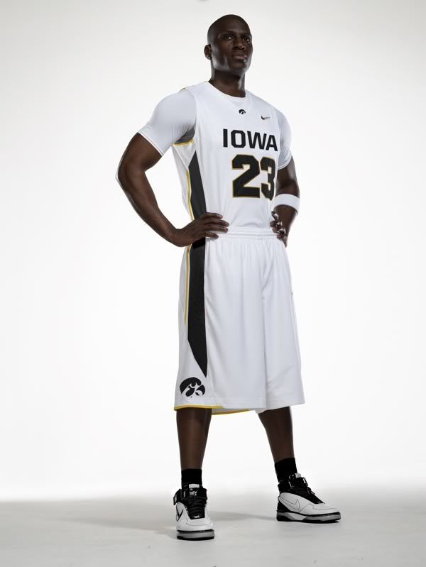
IowaConceptJerseySmaller.jpg
 
home unis never bothered me- it is the black number on black jersey Road Unis i hate-

concept that probably looks good on the computer, but on the court is horrible- and Purdue is as stupid as we are for having those too
 
Nice Work!
Very cool look. Can you also do a mock-up in gold and black as well?

I agree with many that a new era should mean new uniforms.
 
Long shorts don't bother me, actually. I kinda like the design of the jersey! Good job! Simple and effective. Don't really need all the bells and whistles..
 
Curious to those of you in Hawkeye Nation...what about going back to the very OLD time and bring back the cursive "Iowa" from the Lute era? Those unis were pretty simple and would bring back thoughts of the 1980 Final Four team.
 
Like those... could see a throwback utilized as an alternate more often for basketball than in football- seems like all the kids like those things. I think Michigan State did/does something like that- had a standard jersey and brought out the old school Magic Johnson throwbacks from time to time. Maybe I'm in the minority but I'd be for it.
 
Nothing personal (and nice job doing the mock-up), but I don't care for this. IMHO you've been paying too much attention to Nike and everything they've done to ruin sports uniforms. I can't see anything of what I'd consider past classics in there. Just my own $.02 of course.

The current batch of Nike no-trim game jerseys look like practice uniforms to me. I want a game jersey that looks like a traditional game jersey.

The non-arched, no-gold trim "IOWA" looks like it was ironed on by the local sporting goods shop. I don't like the Alford-ish "Nascar Iowa" either. Bring back the vertically arched block Iowa like the baseball team uses. Their black jerseys in particular are sweet.

Personally, I hate it when "2"s have the slanted part in the middle that makes them look like malformed "7"s. Bring back the classic block font numbers like baseball and football use.

The shorts are too long and billowy. Kneecap length is fine, look at the NCAA tournament, not everybody is wearing the ultra-long shorts. Duke and UNI, just for two examples.

Stripe on the shorts is unremarkable - like most of the Nike unis, looks like about 2 seconds were spent on the design.

In short, I want a more traditional-looking uniform. UCLA and Indiana have kept their basic classic designs, just updated them for shorts length and overall fit. We had Chicago Bulls style unis for a couple of years during the TD era, those looked great IMHO and would look good now.

FWIW, I agree with you on the huge collars on the current jerseys.
 
What about going Back in Black and having Black home uni's? If the team wants to resemble a champion, just look to the football team.
 
I like it Huskerland! Is that a point guard and does he come with it? If so, what are his stats?

Yes, as a matter of fact he is a point guard. Lucky for us he's a freshman, averages a triple double, has a 10.9 assist-to-turnover ratio and wants to stay all four years. Oh and he was recruited by Magaret McCaffery. Fran's the Man!
 
home unis never bothered me- it is the black number on black jersey Road Unis i hate-

concept that probably looks good on the computer, but on the court is horrible- and Purdue is as stupid as we are for having those too

Agree that the Purdue black-on-black looks as bad as ours. Actually theirs might be even worse, their shorts look even longer than ours, and the jersey/shorts trim is as invisible as the numbers.
 
Top