Is there an uglier field in all of CFB than Mizzou

BSpringsteen

Well-Known Member
I don't mind some embellishment in designs but this thing is just ******* awful. What is this font they use for the numbers? A 22 yard long logo at midfield? Just awful.


Arizona has Bear Down written on the field that looks awful too.
KEHLBPUHMXUVSIW.20130822204836.jpg


They changed it a lot since I was there last, which I believe was, in July of 2011. The changes look like they happened with the switch to the SEC. It was pretty plain before, I don't even remember seeing any Big 12 logos or anything.

Memorial Stadium is a little larger than Kinnick, there is a track that runs around Farout field as a buffer between the stands and the sidelines. The North "stands" are simple bleachers and most of the North end is a grassy hill w/ their jumbotron on the flat over looking the stadium. They set up the bleachers there for games and a lot of people sit on the grass. The South end is an add on and the locker room (the zoo) is underneath the SE corner. The East and West bleachers are original and the press box is not as large as the new press box @ Kinnick.


now that Maryland is in the Big ten and all that Under Armour money I am just going to get use to seeing hideous *****

600


I actually don't mind Maryland, since it is their state flag. Here are a couple that offend, IMO:

Eastern Washington Univ.
RoosSkyShot.jpg


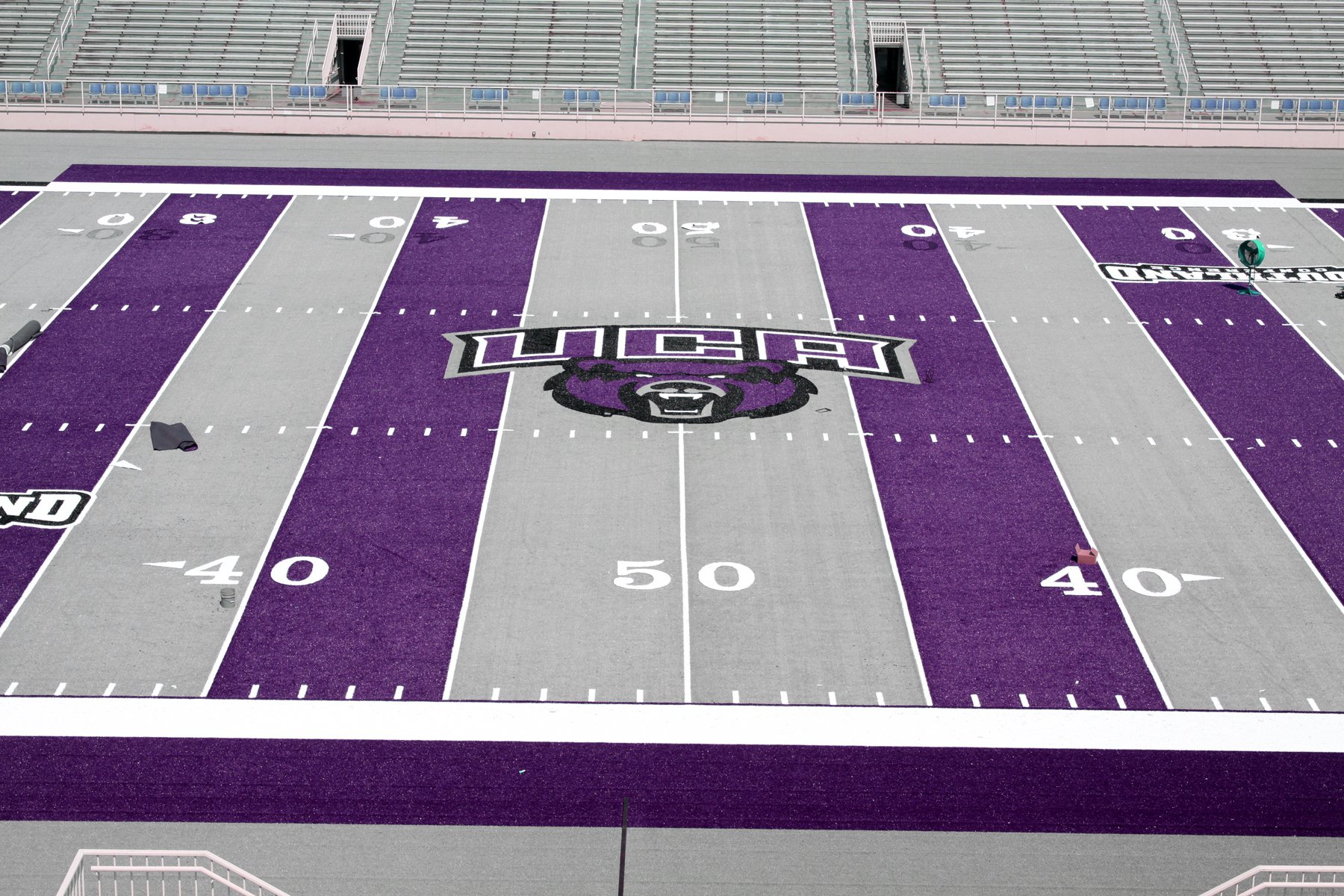
Central Arkansas Univ.
u-of-central-arkansas-field.jpg


Lindenwood Univ.
LindenwoodTurf_t607.jpg


There are plenty of other examples. This turf thing can get out of control. I saw some mock up pictures (jokes, I think) of a purple field for LSU and a plaid one for Delaware.


Logo on Mizzou's 50 yard line (or is it 52 yard line) looks like a cracktiger. How about that Outback Bowl game at Raymond James Stadium in 2010 when PSU played Florida? Mud Bowl it was....


Top