hawkewilly
Member
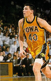
I'll start this by swinging for the fence: Iowa should use the "Iowa" script font jerseys that were previously worn as an throw back as their main template

But... if that's not an option, can Nike at least update the styling? I don't get how Nike decides what schools get updates and when. For isntance, UNI and Loyola have the modern cut jerseys that the blue bloods (Duke, UNC, Kentucky) have. Yet, Iowa, Purdue, and Gonzaga are still wearing these "muscle T's" with shorts that go hang pass the knees that players have to roll at the waste just to fit.


Maybe I'm getting old and just trying to b**ch about something. Or, maybe I'm too young and care too much about superficial appearances. Whatever.. thanks for letting me vent.
But... if that's not an option, can Nike at least update the styling? I don't get how Nike decides what schools get updates and when. For isntance, UNI and Loyola have the modern cut jerseys that the blue bloods (Duke, UNC, Kentucky) have. Yet, Iowa, Purdue, and Gonzaga are still wearing these "muscle T's" with shorts that go hang pass the knees that players have to roll at the waste just to fit.
Maybe I'm getting old and just trying to b**ch about something. Or, maybe I'm too young and care too much about superficial appearances. Whatever.. thanks for letting me vent.
")