You are using an out of date browser. It may not display this or other websites correctly.
You should upgrade or use an alternative browser.
You should upgrade or use an alternative browser.
New Basketball Uniforms
- Thread starter zhawk21
- Start date
1977Hawkeye
Well-Known Member
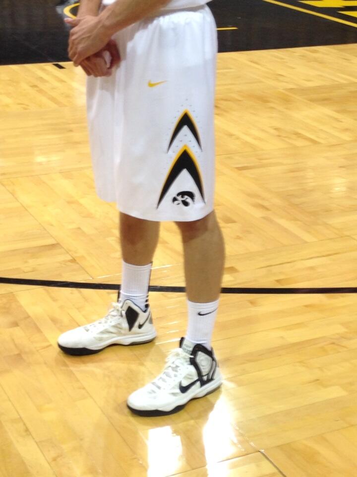
Also saw this one on another site. Personally I think the "arrows" on the side are a little tacky but that's just my opinion.. But whatever I guess. Just as long as the team plays well in them...

clicheusername3
Banned
Yawn...thanks Nike.
I like them. They aren't anything special, but I'd rather not have something over the top. I'm convinced whenever you talk about uniform changes with Hawkeye fans at least 75% of them are going to find something to whine about.
Anything less than bringing back the Acie Earl era half black/half white shorts was going to have be complaining.
wundergrape
Well-Known Member
Don't give two shin spilnts about uniforms. Go Hawks!
conn53victor
Well-Known Member
Don't give two shin spilnts about uniforms. Go Hawks!
I personally am happy that they have uniforms. But other than that, I care about basketball.
volhawk50
Well-Known Member
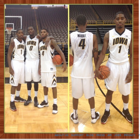
A net? That's the design we get for the back, at least it wasn't a cornfield I guess.
Really. I was thinking/hoping it would be the Old Capitol, like Texas has the tower, Duke has the Chapel, and Georgetown has the John Carroll statue on the back of their jerseys. Guess we aren't good enough for Nike to honor our history and campus landmarks like they do with other schools.
I actually love these and can't wait to see the gold one. I like ISU's new ones as well.
Jjgoiowa11
Well-Known Member
Don't give two shin spilnts about uniforms. Go Hawks!
Cool story you ol fuddy duddy
BrueCrew3
Well-Known Member
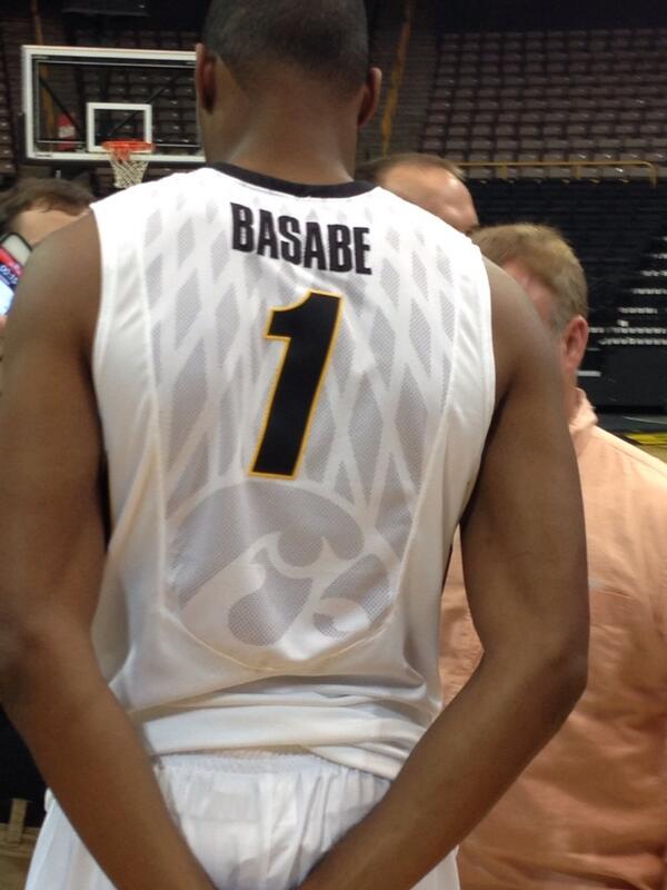
I actually like it. I like the greyed out Hawkeye on the back.
Don't give two shin splints about uniforms. Go Hawks!
I agree with both these. I don't want anything gaudy, like Notre Dame. It's simple, yet incorporates some of the newer fabric technology. It will be interesting to see the road/alternate styles.
As for Vunder .. he is spot on. We could go back to the high, tight shorts for all I care .. as long as we win!!
GO HAWKS!!!
tm3308
Well-Known Member
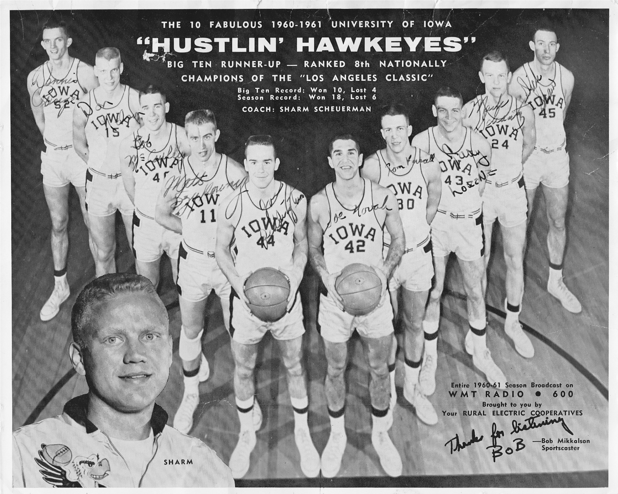
Will not be satisfied until these become permanent alternates:

My first choice would be to have an Elite version of the throwbacks as our "permanent" uniform style (maybe incorporating the old Flying Hawk in the back watermark, or something like that). Those are still the best uniforms I've every seen Iowa wear.
Second choice would be to use what they came up with, only with a different font than the Alford era one.
Jjgoiowa11
Well-Known Member
My first choice would be to have an Elite version of the throwbacks as our "permanent" uniform style (maybe incorporating the old Flying Hawk in the back watermark, or something like that). Those are still the best uniforms I've every seen Iowa wear.
Second choice would be to use what they came up with, only with a different font than the Alford era one.
Yes, to all of that. I cant stand the alford font...I cant believe they still use it but glad they nixed that goofy collar.