You are using an out of date browser. It may not display this or other websites correctly.
You should upgrade or use an alternative browser.
You should upgrade or use an alternative browser.
TIGERHAWK AT THE 50: Now Official
- Thread starter JonDMiller
- Start date
SteveGarvey1
Well-Known Member
The graphic of the field looks my electric football game I had when I was a kid, except with NFL logos instead of Hawk stuff.
MelroseHawkins
Well-Known Member
Was hoping for a bigger version
Ohio St would have had the feathers and beak stop at the 30 yard lines.
MelroseHawkins
Well-Known Member
What the hell are we going to talk about on this site now?
AP - BREAKING NEWS - June 12, 2017
Iowa City, IA - Hell has frozen over.
AP - BREAKING NEWS - June 12, 2017
Iowa City, IA - Hell has frozen over.
Last edited:
99topdawg
Well-Known Member
Was hoping for a bigger version
That's what she said.
.png)
tksirius
HN's Love Doctor
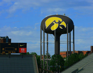
I'm afraid it's too late. Once the north endzone remo is complete, we won't be able to see much of the water tower anyway.

EstronHawkKing
Well-Known Member
and our new mascot
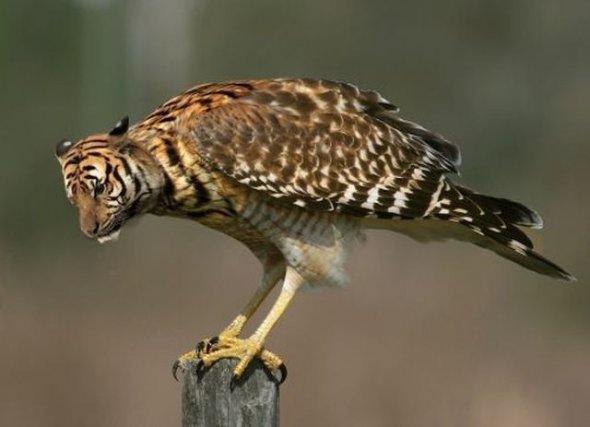
Grew up in IC, love the Hawks and agree that Hayden walks on water but... I agree Josh. It's a cartoon that looks more like a parrot than a hawk or tiger. Let's go back to the flying Hawk or some other logo. I guess that this view point will have to wait a few decades...
I don't l
I don't like 50 yard line or half-court logos that are massive. This one is fine.
Ohio St would have had the feathers and beak stop at the 30 yard lines.
I don't like 50 yard line or half-court logos that are massive. This one is fine.

MelroseHawkins
Well-Known Member
I don't l
I don't like 50 yard line or half-court logos that are massive. This one is fine.
Oh gaaawd, yea, I don't like them either. I was just pointing out how ridiculous some schools get with those massive logos. Hate 'em. Hopefully Iowa will set the new trend with sensible size logos.
Oh gaaawd, yea, I don't like them either. I was just pointing out how ridiculous some schools get with those massive logos. Hate 'em. Hopefully Iowa will set the new trend with sensible size logos.
The only time I like the big logos is in basketball when they have the shape of the state at midcourt and the announcer says, "He took that shot from ____" and names a city near where he shot from.
STILLBUSTER
Well-Known Member
Now, Herky is gonna spear himself right in the face every time he plants the flag!
Bad Karma.
Bad Karma.
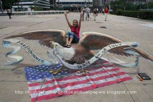
imagine if they used the same techniques on the tiger hawk as the amazing sidewalk art

Players might trip!
hawkdrummer1
Well-Known Member
I find it interesting that we're just now getting around to putting a Tiger Hawk at the 50 (nearly 40 years after its introduction).
Meanwhile ISMoo is looking at redesigning their unis and logo AGAIN. How many times can you sandblast and refinish a turd?
Meanwhile ISMoo is looking at redesigning their unis and logo AGAIN. How many times can you sandblast and refinish a turd?
Joshbrown
Well-Known Member
Grew up in IC, love the Hawks and agree that Hayden walks on water but... I agree Josh. It's a cartoon that looks more like a parrot than a hawk or tiger. Let's go back to the flying Hawk or some other logo. I guess that this view point will have to wait a few decades...
Not sure I'd wanna go back. Reminder of the bad times. But replaced with the crackhawk? . . . ohhhh baby!!